CERF Blog
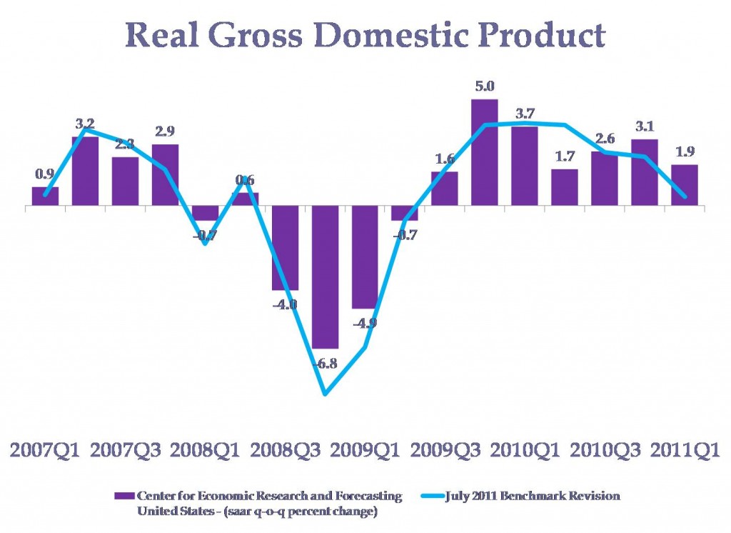
Continuing my commentary on last Friday’s GDP release, here is a chart showing the revisions to real GDP growth.
It might seem like some quarters are up and some are down, in effect a wash. Despite that appearance, on net, the new measure implies that growth was slower during the 2007 through 2011 quarter 1 period.
The purple bars show the old measurement, and the blue line shows the new measure.


